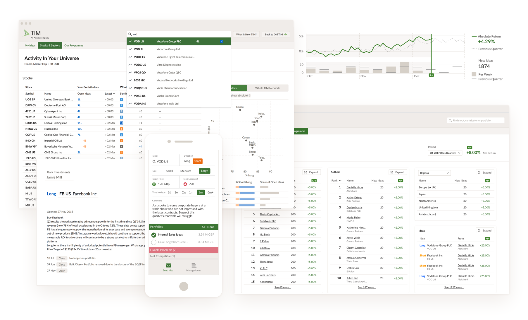
TIM — Redesigning a legacy tool
Challenge
Fix confusing, inefficient workflows in a legacy system that served multiple audiences.
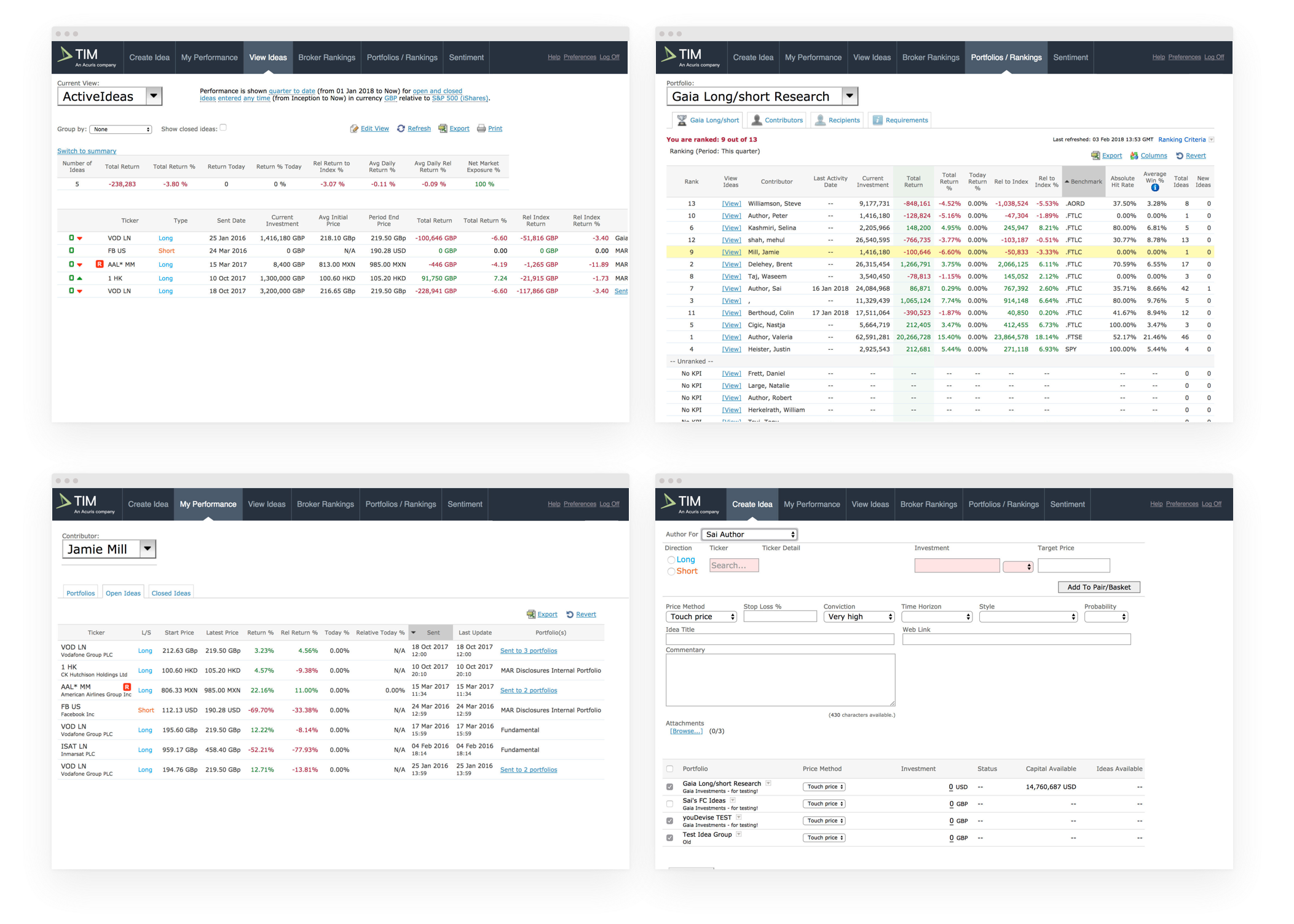
What is TIM?
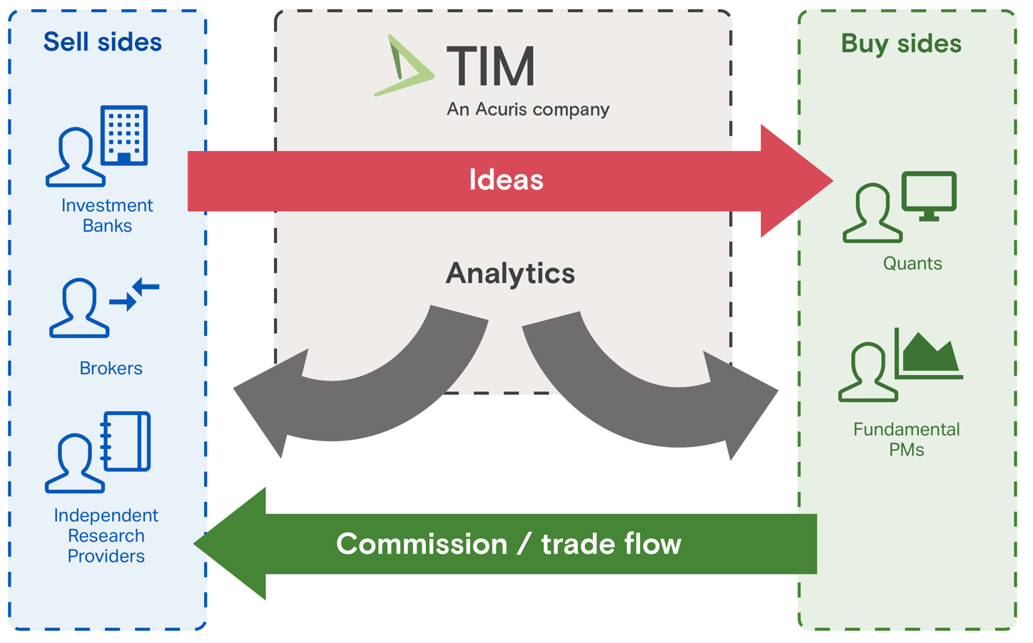
It’s a platform that creates a network allowing thousands of salespeople at investment banks and brokers to send their trade ideas (like “buy Vodafone because…”) to their clients at hedge funds and pension funds.
Genesis
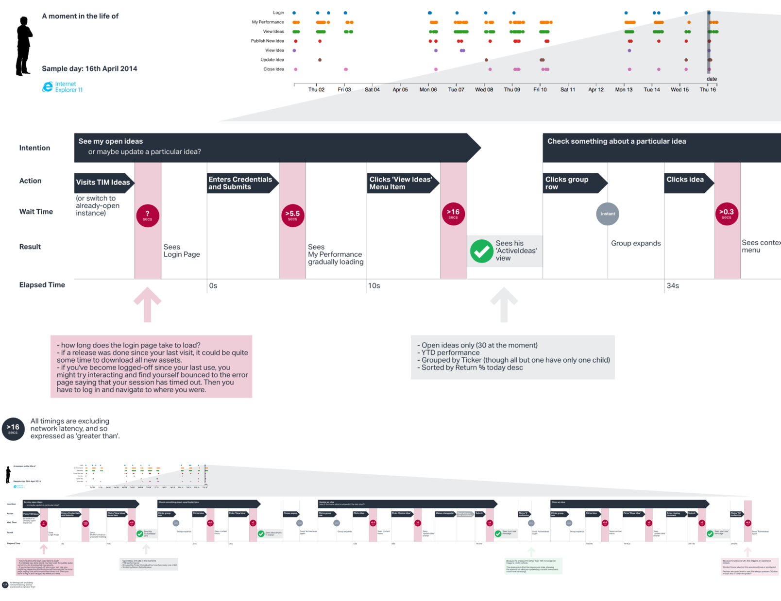
I put together this journey map to visualise the number of steps in a common workflow. I added typical waiting time at each point.
By showing the unnecessary steps he had to go through, I made the case that rethinking workflows would be necessary in addition to performance optimisations.
Strategy
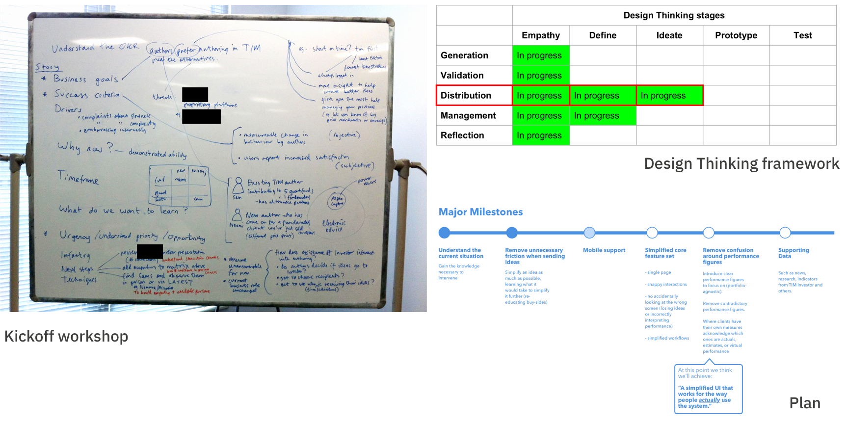
Clockwise, from left:
Kickoff workshop with Co-founder, Head of Product, Product Manager, and I.
Excerpt from status update showing how Design Thinking was guiding our Discovery process (the rows represent the five key workflows we identified during research).
As we started to understand the project I put together this proposed plan for the steps it might take to reach a key outcome: "A simplified UI that works for the way people actually use the system".
Research & Definition
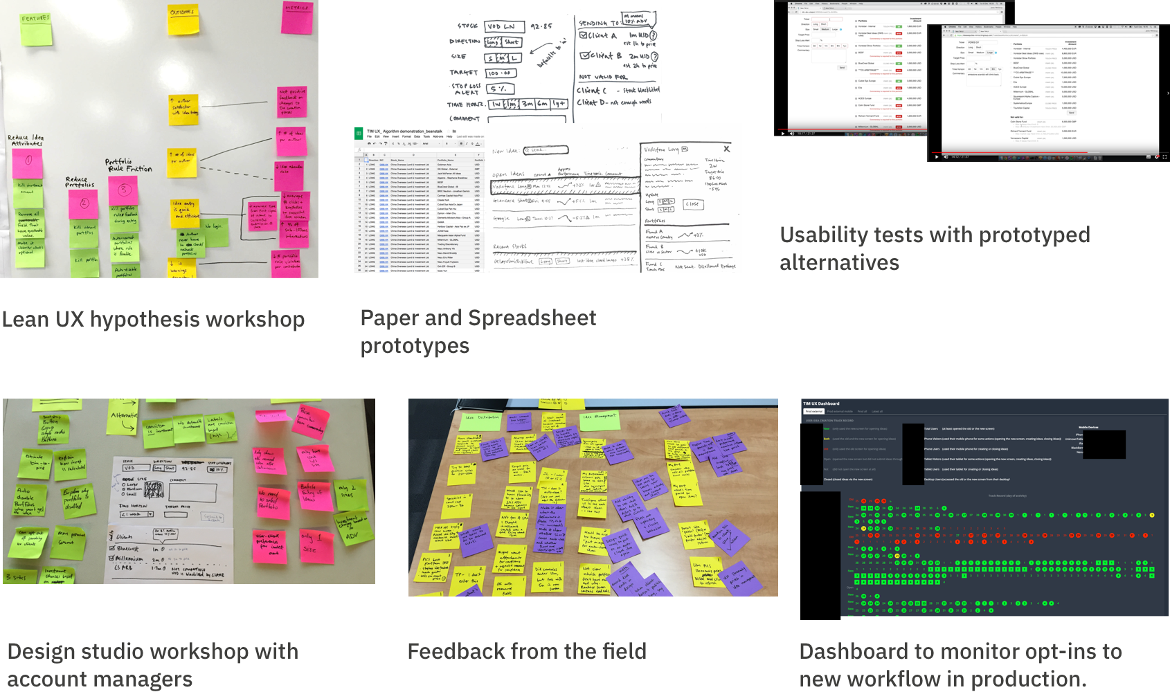
Design of first workflow
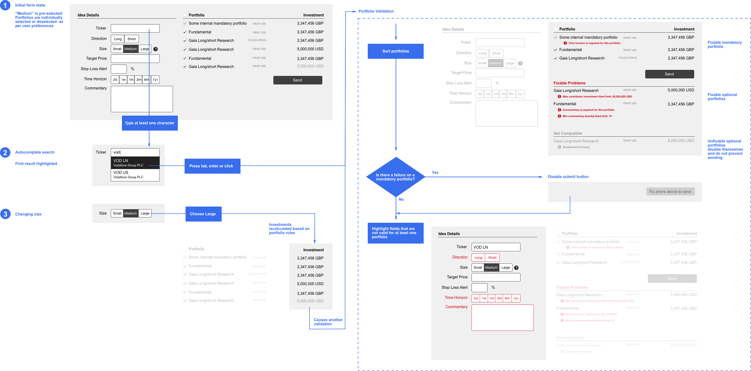
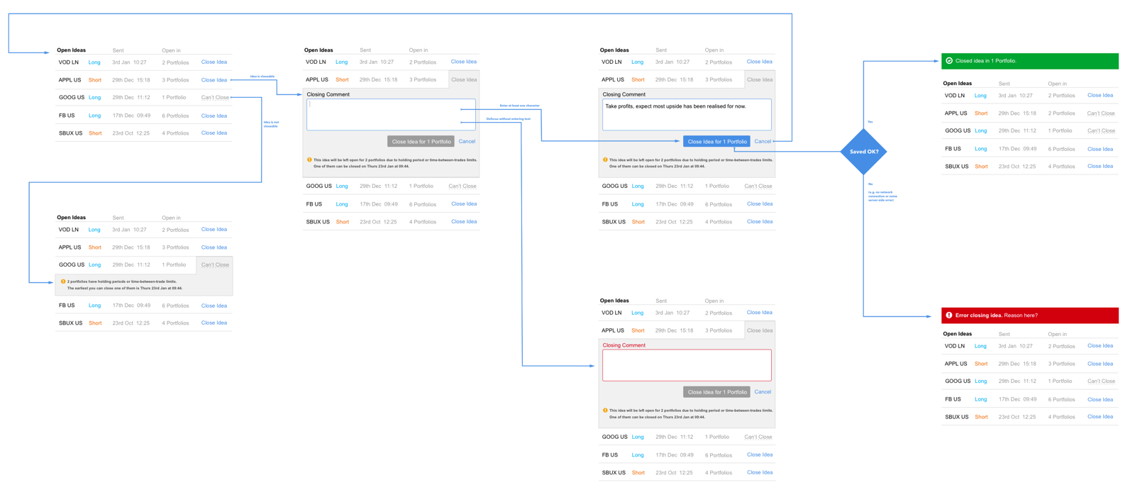
New Flows
Vision
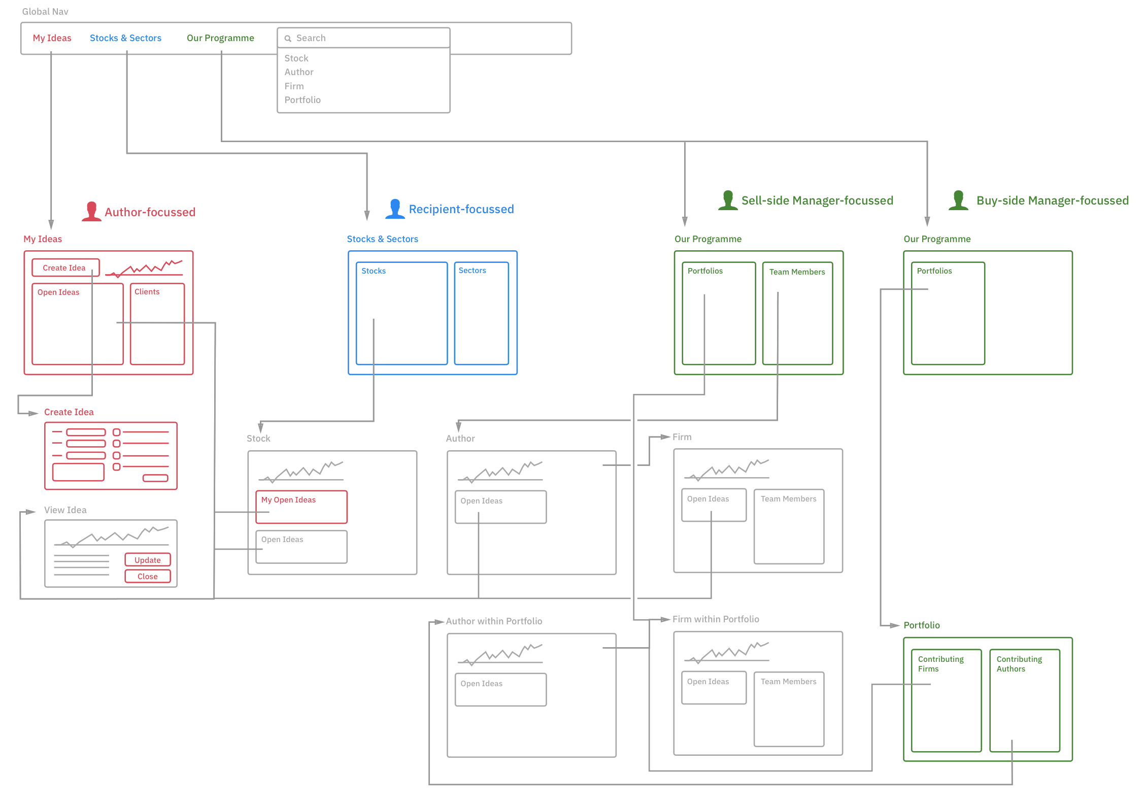
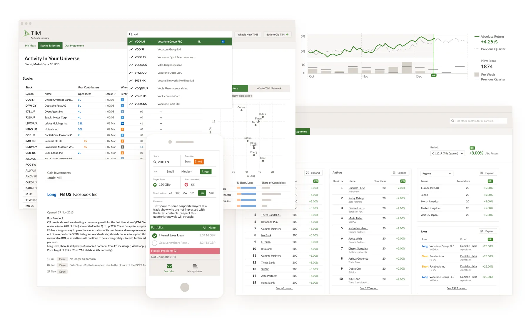
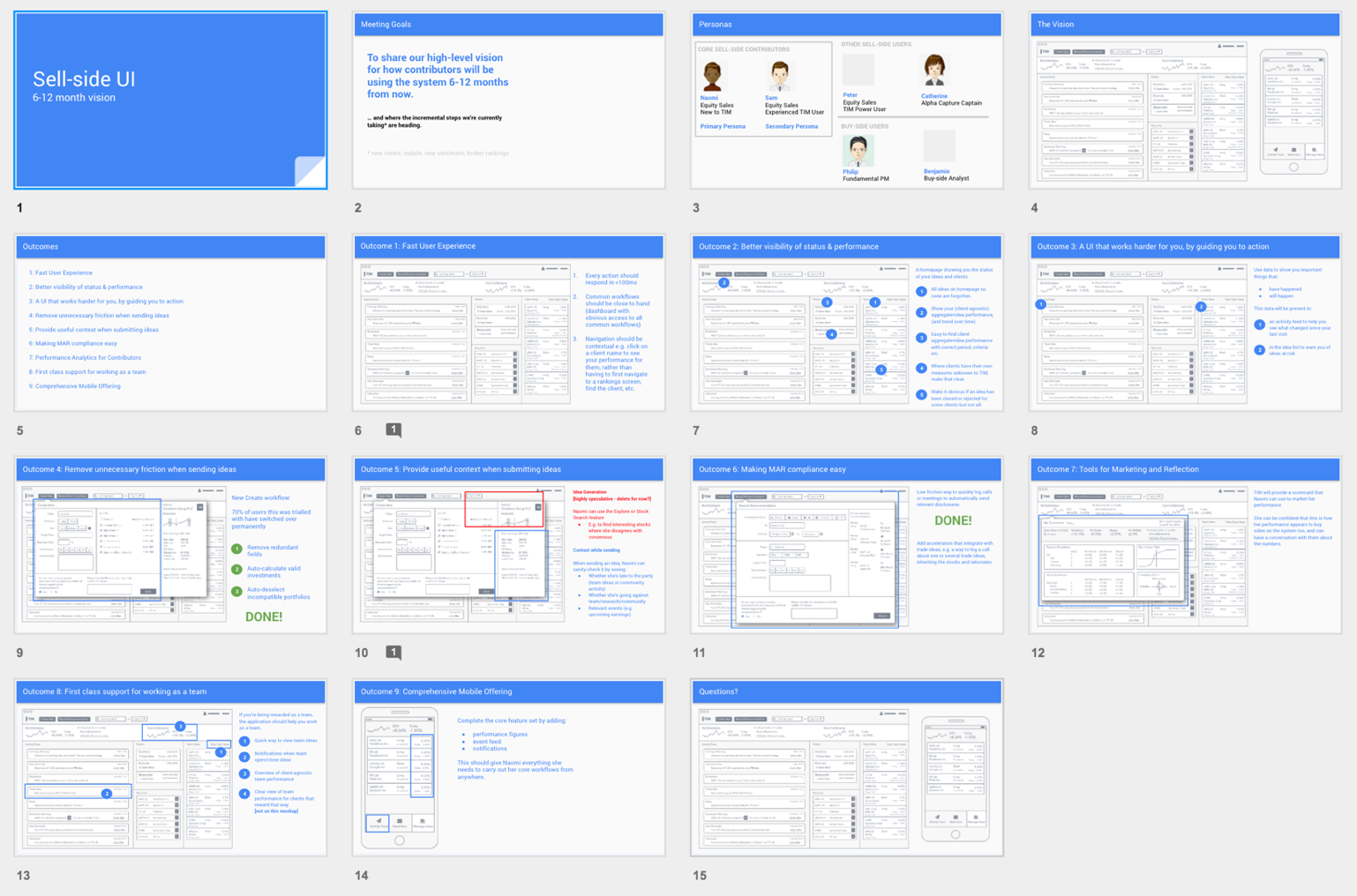
I presented this vision to stakeholders to encourage them to prioritise a future phase. It included nine key outcomes, and wireframes to help visualise the suggested changes.
Outcome
- 70% of authors chose to use the new contribution workflow.
- Innovations that came out of user observation have been validated by other users, saying “it gives me everything I need to do my job”.
- The research and design guided us which workflows to move to a new architecture where interactions can complete in ~100ms. This is sharp contrast to the old workflows where actions could take 5+ seconds.
- We grew new confidence that we could make daring changes to legacy workflows.
- Account managers now believe “meetings are better when product comes along”. Before, they had been reluctant to take product people to do user research.
