Relive — Rearchitecting the post module
This is an example of an interaction design project I led at Relive.
Challenge
The Relive app has a social feed of activities posted by your friends, and the primary component is a ‘post’ module.
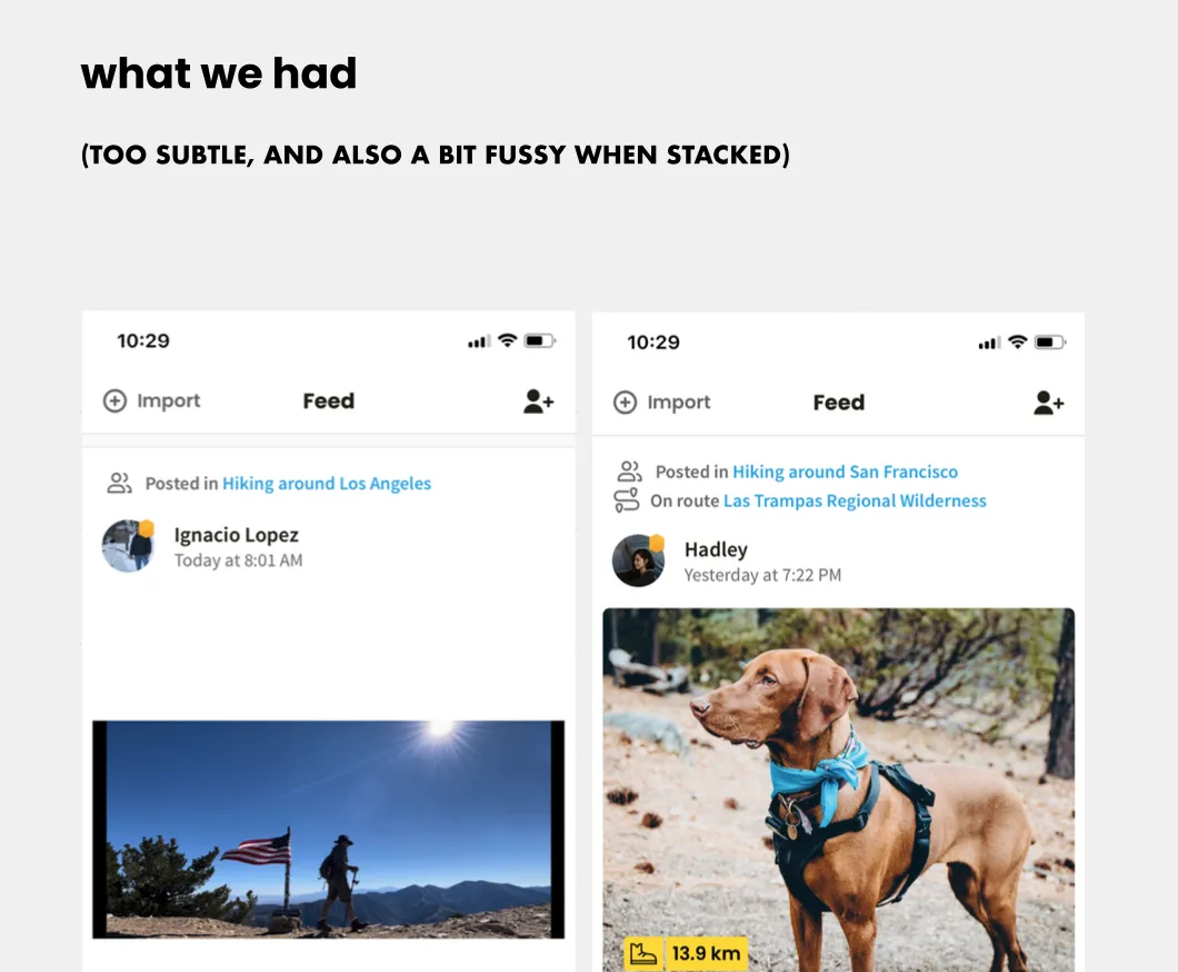
That original post module used to only show showed activities from people you follow. But when we added communities (a bit like Facebook Groups) things got more complicated. Now it could show you content from strangers in the same community, and that content could be more than just activities, and it could be posted on deeper objects like routes or challenges.
A recent round of research showed that users were unsure why they were seeing this new content, and who the people posting it were. Analytics confirmed that few were engaging with it.
Our initial idea was a quick fix to highlight more strongly the community name, and any related objects like routes or challenges. But it felt like we were making everything shout at you, and it was confusing having two calls-to-action in the same yellow box.
It was time to take a step back to rethink this module now that it has more work to do than it was originally designed for.
Design Jam
I planned a two-hour design jam with the designers on my tribe to generate ideas together. It included:
- Framing - what’s the problem, and why now, including review of recent research findings.
- Time machine exercise - what does success and failure look like for this?
- Concept model review - ensure we all understand the data model and variations this needs to cope with
- Benchmarking - how do other apps solve this problem?
- Sketching - two rounds of sketching and sharing for feedback (a.k.a. crazy 8s)
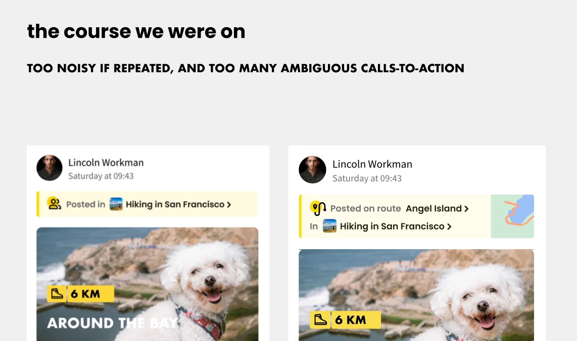
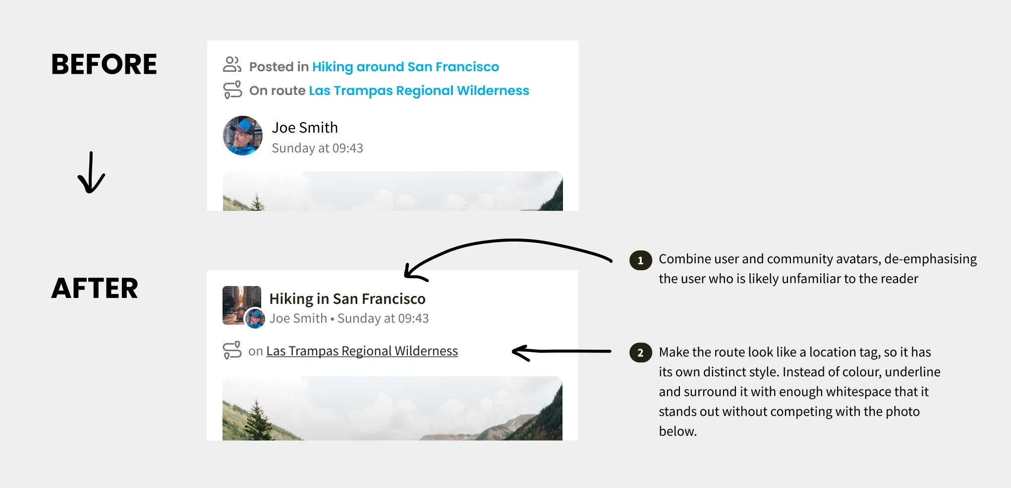
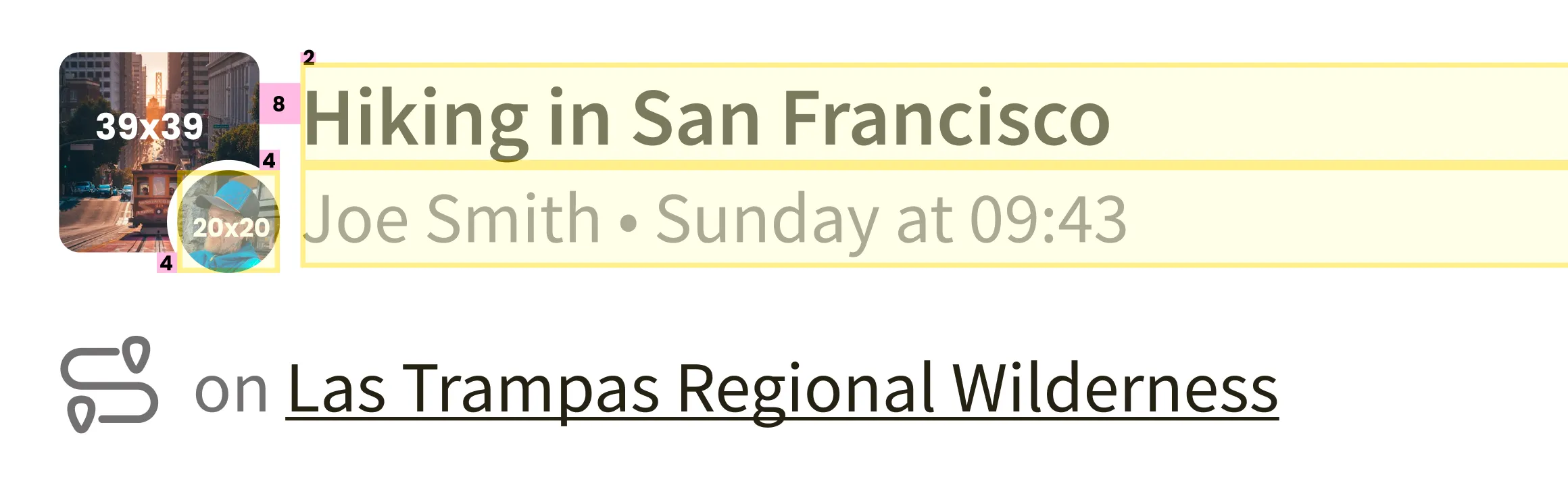
During the benchmarking, we noticed that Facebook Groups replaces the large user avatar with the avatar of the group, and overlays a much smaller avatar for the user who posted something in the corner. We thought this was really sensible, since research insicated out users are much more likely to identify with the group (e.g. “Hiking in San Francisco”) than the user who is likely a stranger. It also felt like there were fewer equally-weighted pieces of metadata fighting for attention, and allowed us to give more prominence to the community, which is where we wanted people to tap if they were interesetd. So that was a strong favourite to take forward to the next stage
Hi-fi Refinement
Next a few of us worked up our ideas at a higher fidelity in Figma. We liked the community-as-avatar idea but still had questions about how to indicate when content is posted at a deeper level than the community (e.g. a route inside a community). Should we show it like a cross-post on Reddit? Or a quote tweet on twitter? Should there be a thumbnail of the route to make it stand out, or just show a subtle link to the route?
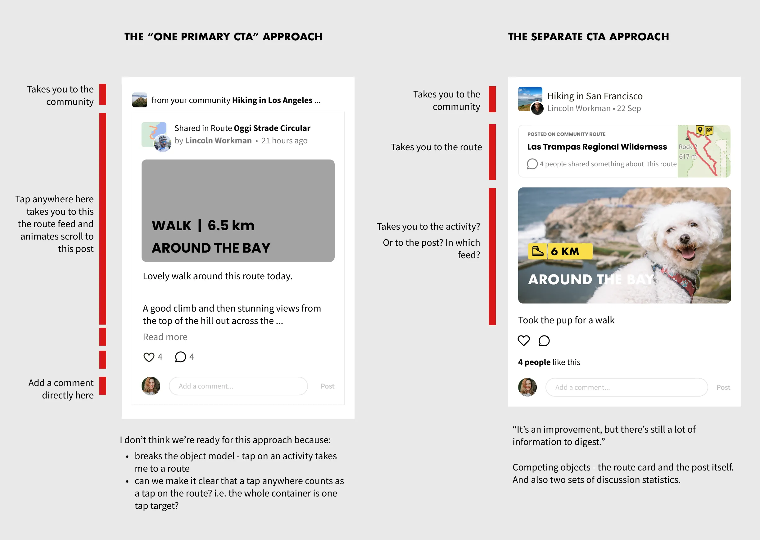
We were anxious to show that linked routes are also like mini communities with their own discussion feeds and that was making us feel like we have to do more.
Eventually we decided to not try to do too many things at once, since the main priority should still be to encourage people to view the actual post someone shared, and the discussion on that object. That’s more important than driving them to related areas like the community or route. This was a constant tension we found: wanting to encourage behaviours that were important for our current bet but secondary to the overall use case of communities.
The outcome
We released this as an A/B test and saw a slight but significant increase in visits to the community with the new post design. We also felt that the feed looked a lot tidier without so many boxes competing for your attention.