TIM — Creating a new product from scratch
Challenge
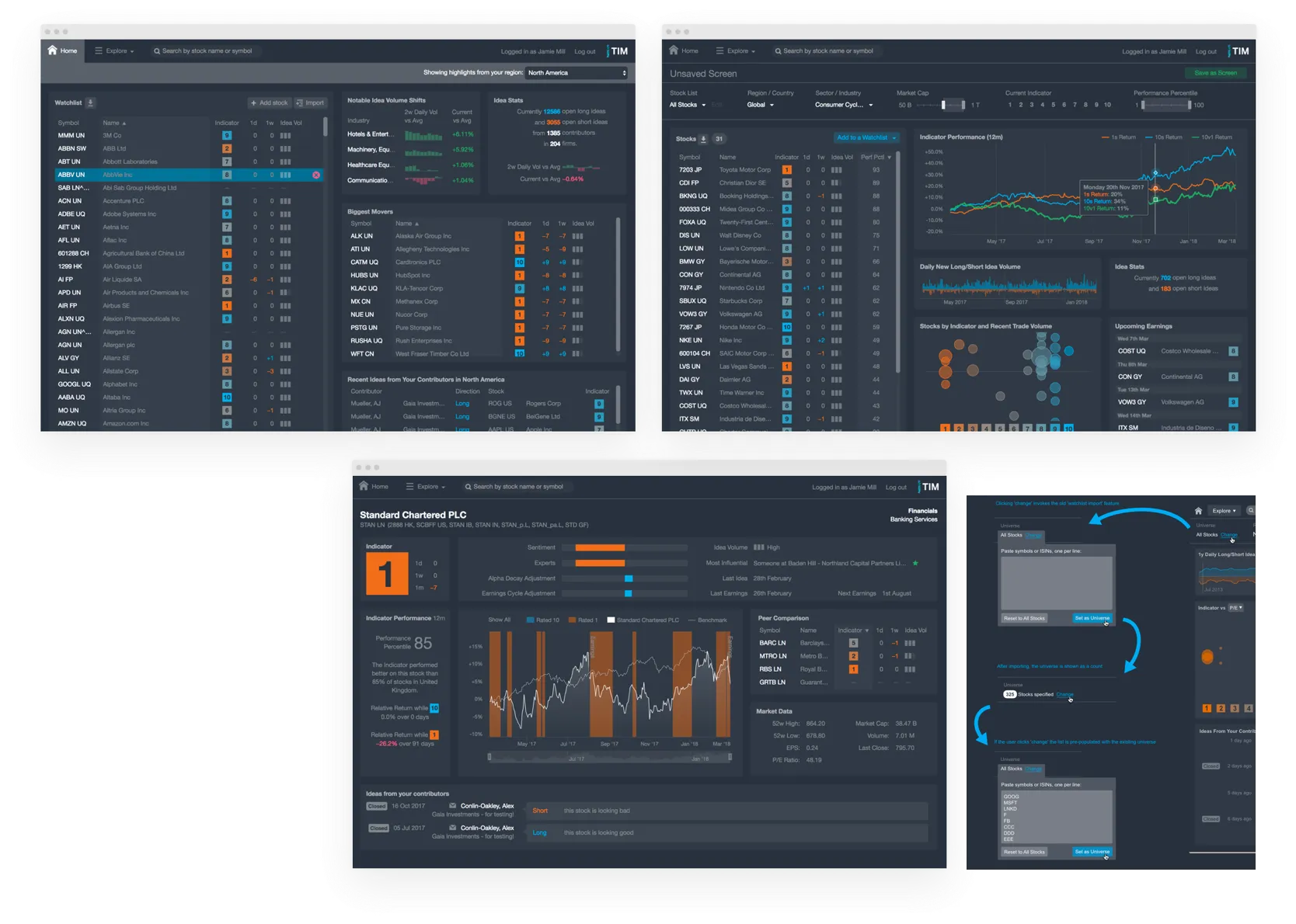
Design a new product that allows traders and portfolio managers to use the the TIM Indicator in their trade timing process, or find interesting stocks to investigate further.
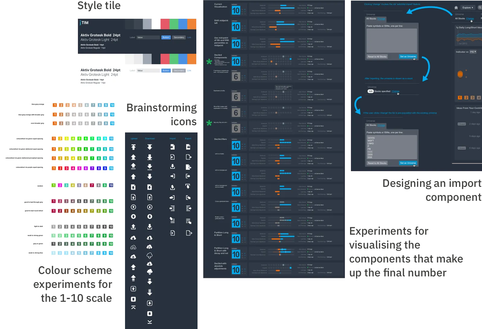
The Indicator is a rating of each stock from 1 to 10. It’s predictive of stock prices and is based on the aggregate sentiment of thousands of brokers.

UX design: Stock screener
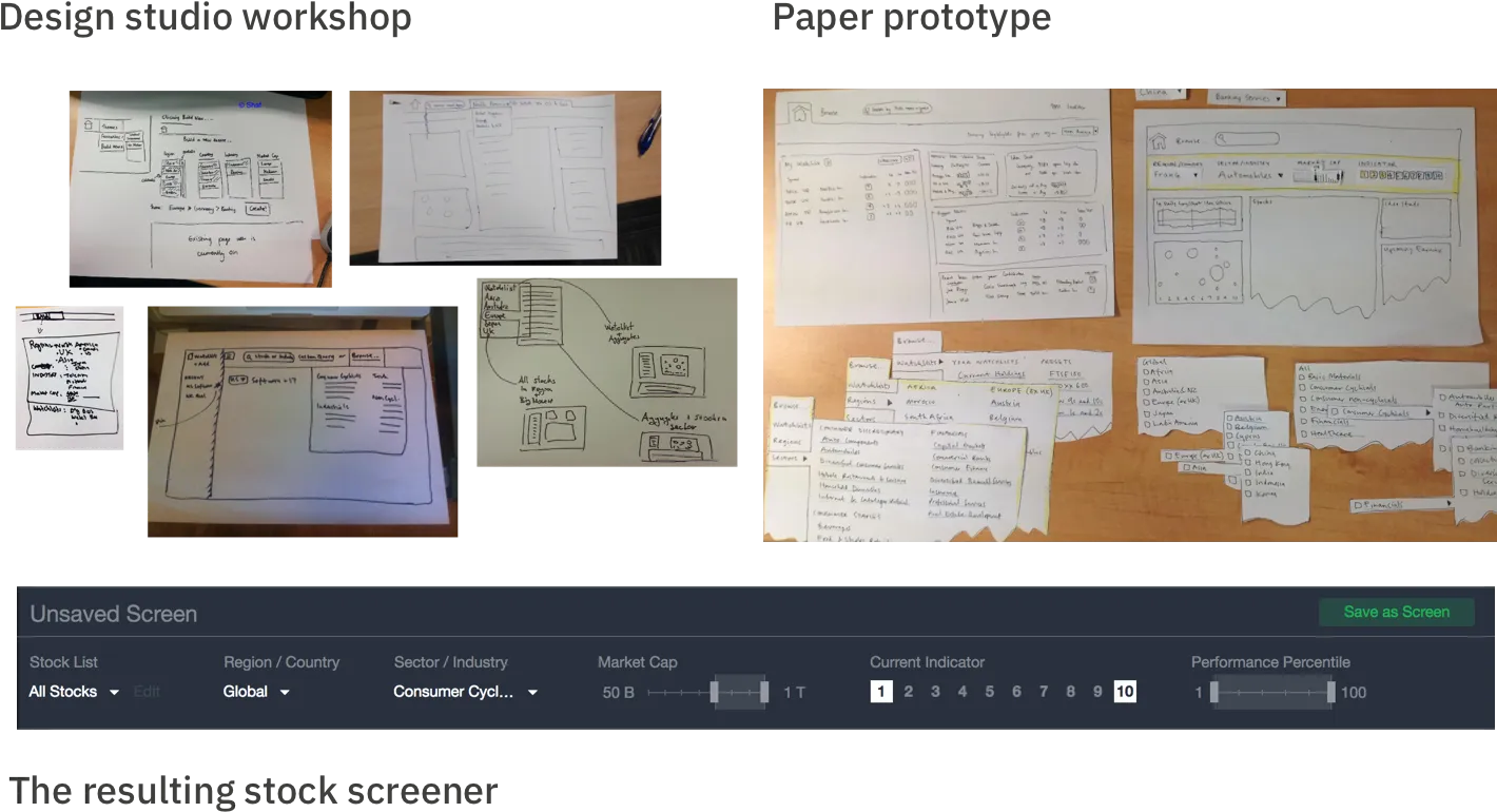
For a typical feature I’d take the Product Owner’s ideas, do some competitive research, and run a design studio workshop with engineers.
For the stock screener, the PO envisioned a query builder but I wondered if we could treat it more like natural navigation. I ran a design studio to gather ideas, and refined it with usability testing of a paper prototype. It worked really well and became the heart of the application.

UI Design
After experimenting with dark and light UIs, we chose dark because:
- Customers spend a lot of time dark UIs like Bloomberg and told us they don’t like switching back-and-forth to light UIs
- The dark UI made the data stand out well on screen
- It was seen as beneficial to the business that it looked significantly different to our legacy product
The dark UI was problematic for printing screenshots in marketing material, though - meaning I had to make special versions with bold white text to compensate.

Outcome
TIM Investor allowed us to test the value proposition of the signal with a diverse range of customers.
I’m proud of the speed at which we brought a brand new product to market, and the collaborative design I did with the business expert.
Looking Back
Went Well
- Converting the output-based request to outcomes, and designing from there led to a radically different (and hopefully better) design.
- Applying the principle of “no modes”, and letting the user interact with domain objects (Industry, Region etc) worked well.
- The PO and PM were remote, in our New York office, and that did make collaboration hard at times. But Google Hangouts and Docs, and the occasional cross-atlantic trip helped.
Could Improve
- We weren’t fully invested in a metric-driven approach. The success criteria gave us a shared view of expectations, but we didn’t build a process around reviewing usage and deriving learnings since there were many parallel efforts going on in sales and financial metrics to find a product-market fit, and we quickly moved on to other features.
- I didn’t do any first-hand research with users due to this being a primarily sales-led effort, with most prospects in a different country. I had to rely on second hand information about how well this was working for people.