Visual design challenges
In my day job I don’t always get to work on visually-creative projects. Here are some responses to design challenges took part in on the Designer Hangout slack group.
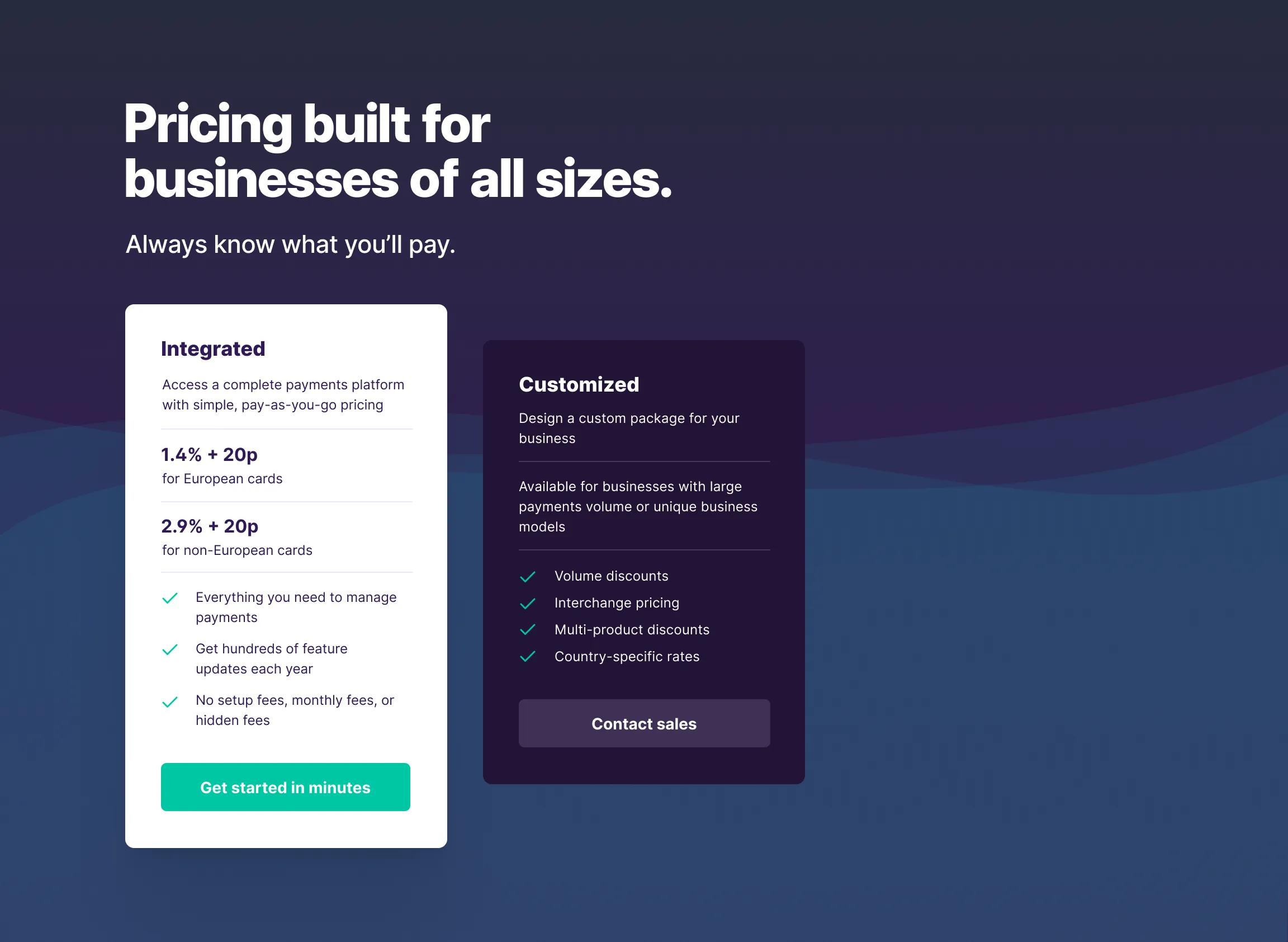
Pricing page
A pricing page using provided content. The first price option had to be emphasised in some way. I went all Inter: Display for the large text, Extra Bold for headings, and Regular for the body text.
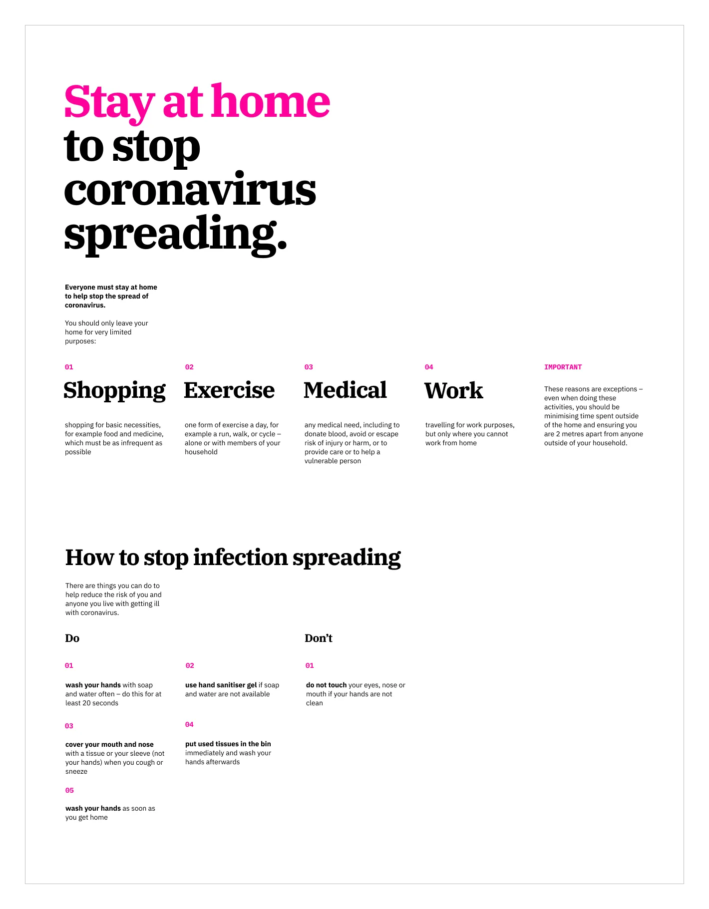
Information poster
An information poster, using provided copy. Must use only use these three colours: Black, white, and hot pink (#FF0099). No imagery allowed. I chose the whole IBM Plex type family: Serif, Sans, and Mono.
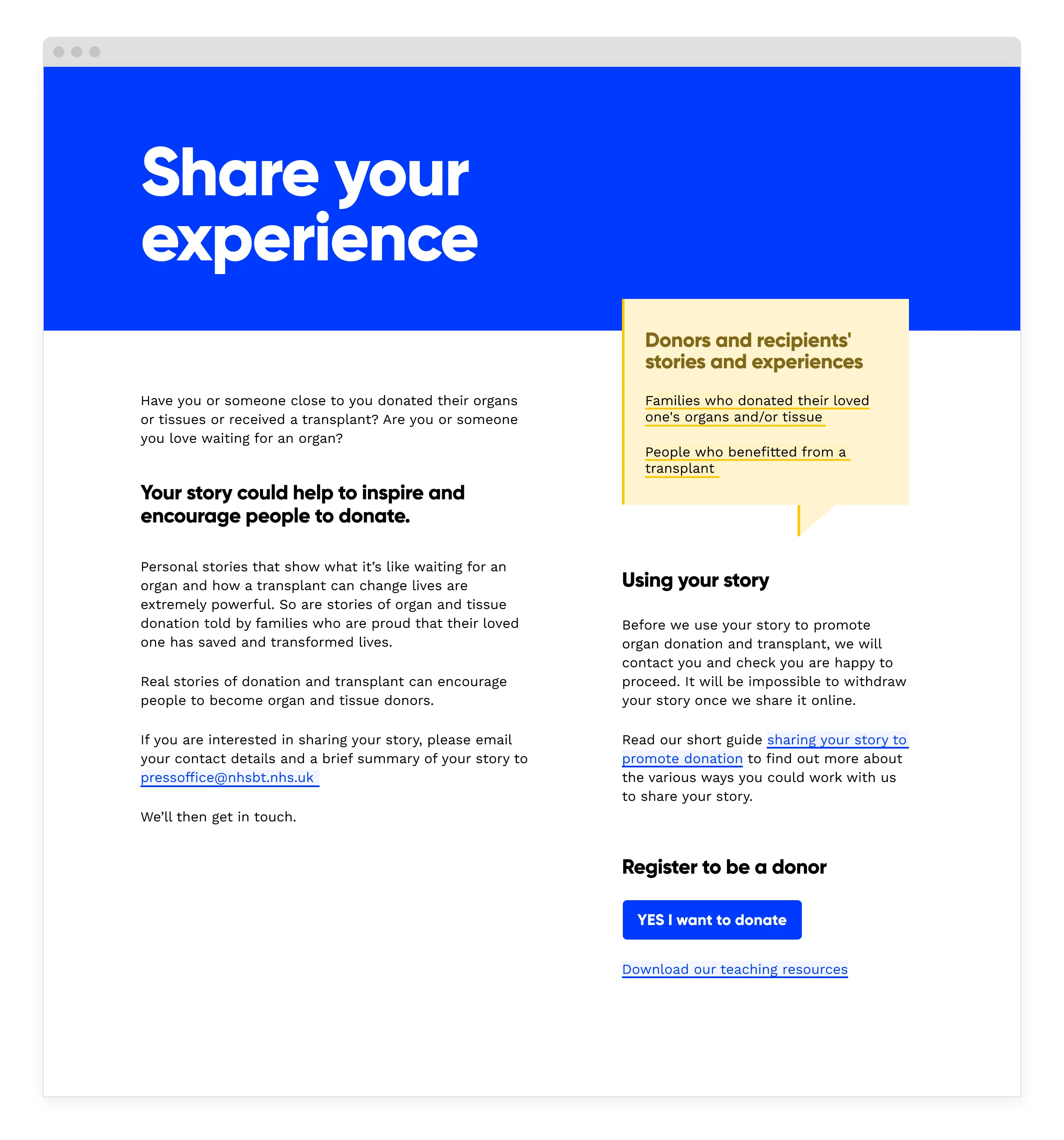
Web page
A design for an NHS organ donation web page, using provided copy. Must only use these four colours: Black, white, #003AFF, and #FFC500. Shades and tints allowed. I chose Gilroy for the headings and Work Sans for the body.
Style tile
A style tile for a children’s entertainment brand. I chose Rubik Mono One for the display face Inter Medium for the body.
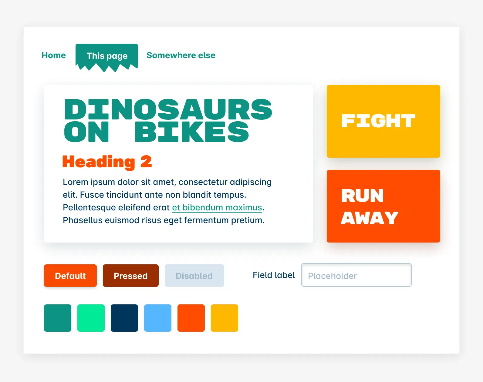
Blog post
A blog post, using provided content. Not allowed to use imagery in any way. I chose Alegreya for the author’s voice (headings and body), and Inter for utility text.
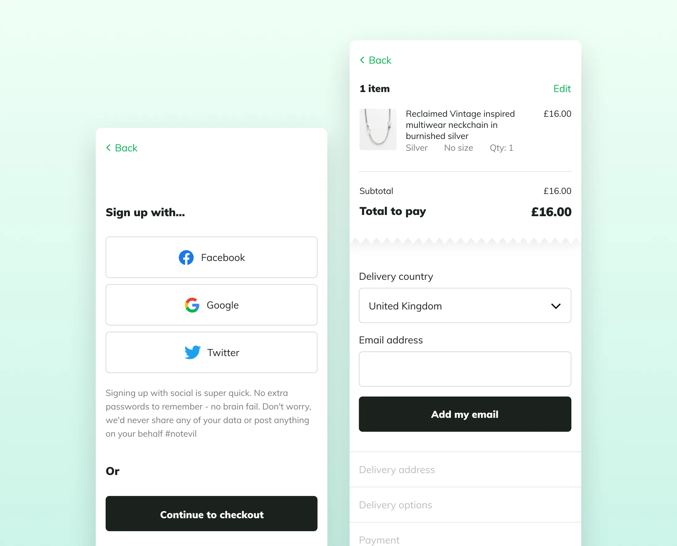
Checkout flow
Part of a checkout flow, using provided content. Must use this jade green #00B84A somewhere. No imagery except the provided product image. The type is Mulish Regular and Black.