Case Study
Visual identityInteraction DesignInformation ArchitectureVisual DesignSite build
Yorkshire Wolds Heritage Trust website and visual identity
Context
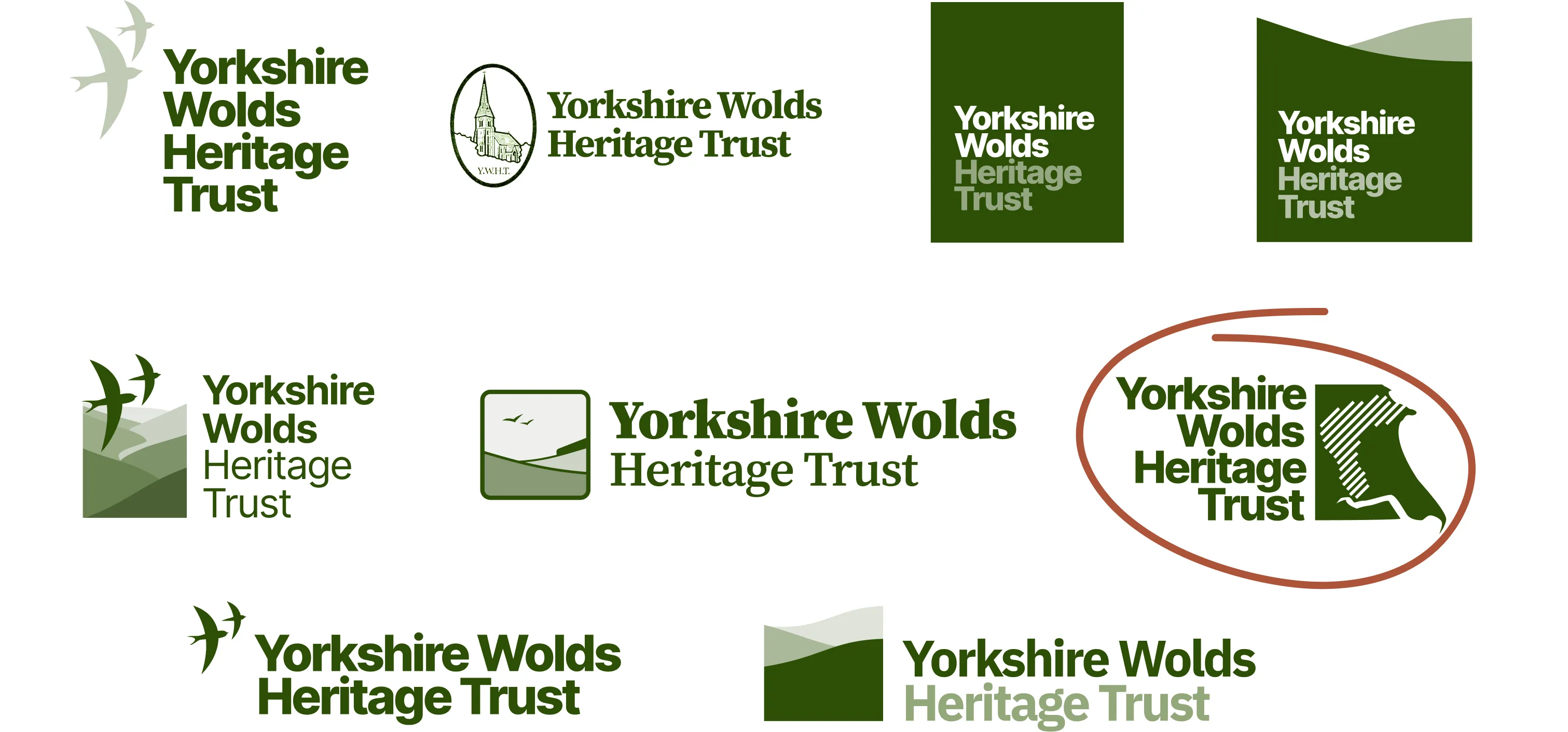
The Yorkshire Wolds Heritage Trust has had a website for many years, but it was basic, designed for older devices, and rarely updated. The charity didn’t really have any particular brand or design language other than a logo that wasn’t conveying the right message any more.
Goals
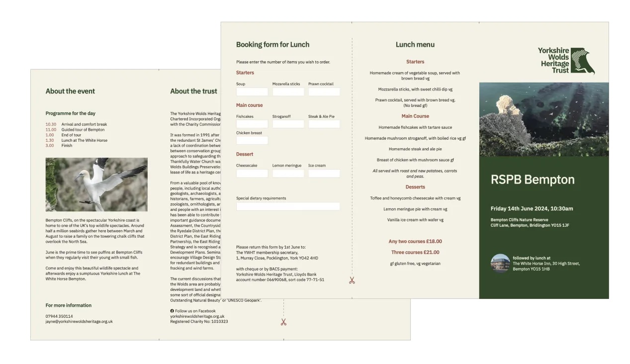
- Identity: A new logo and visual language to convey the trust as an authoritative but approachable entity, with design elements that could be used across web and printed material.
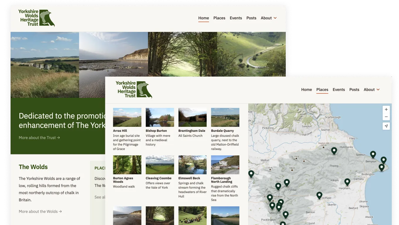
- Utility: Facilitate event registrations, showcase important locations around the wolds.
- Responsiveness: With 40% visits coming from mobile, it was crucial to update to a mobile-friendly site.
- Editability: Make the website easier to update for staff.
Visual identity
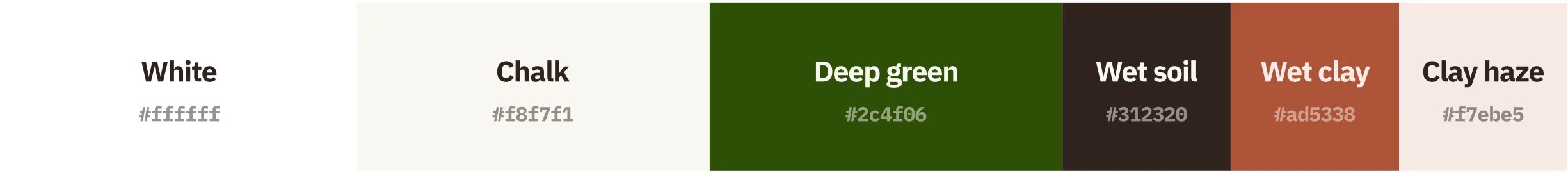
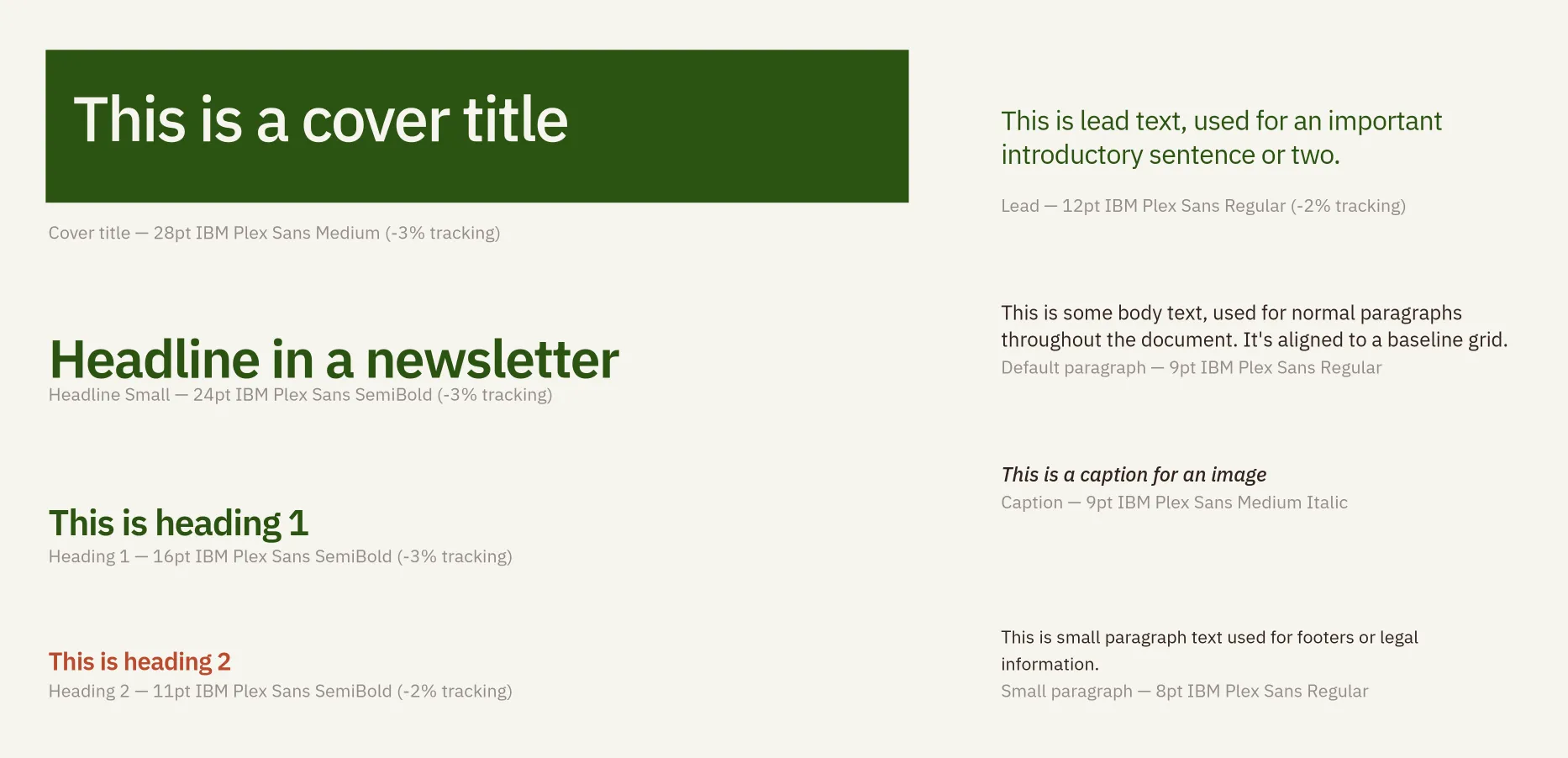
For typography I used IBM Plex Sans, which is businesslike but friendly. It has nice details that emerge at larger sizes, but remains legible when small.
Implementation
The new site is static, built with Astro.build and Decap CMS.
The interactive place map is built with maptiler, typescript, and some custom GeoJSON generated with QGIS.
Outcome
- members say it’s now much easier to find the latest news and events
- a large portion of event registrations now happen online, making it easier for members, and reducing administration for staff
- increase in impressions and clicks from Google, thanks to more content
Live website
Visit the site at https://www.yorkshirewoldsheritage.org.uk